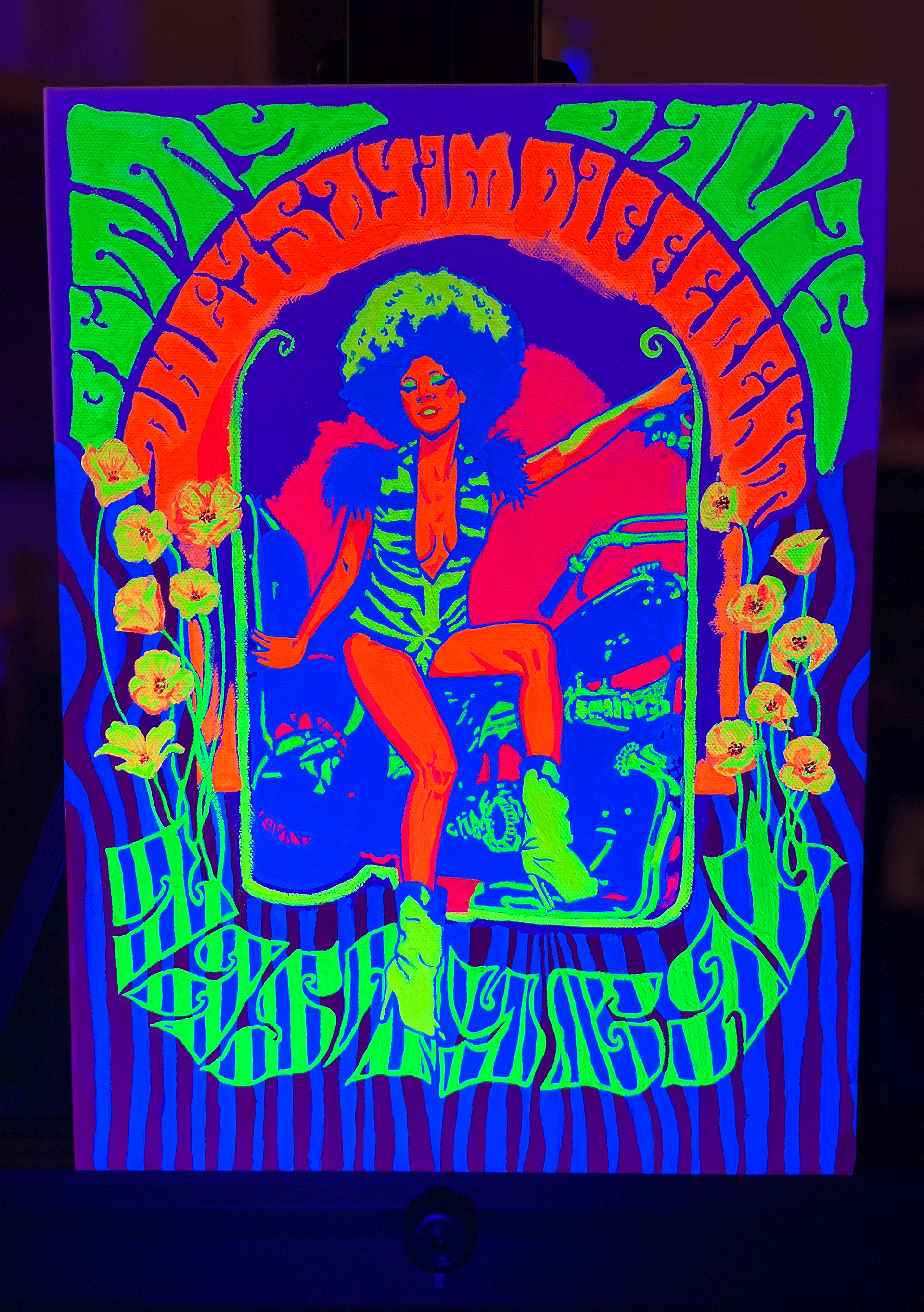
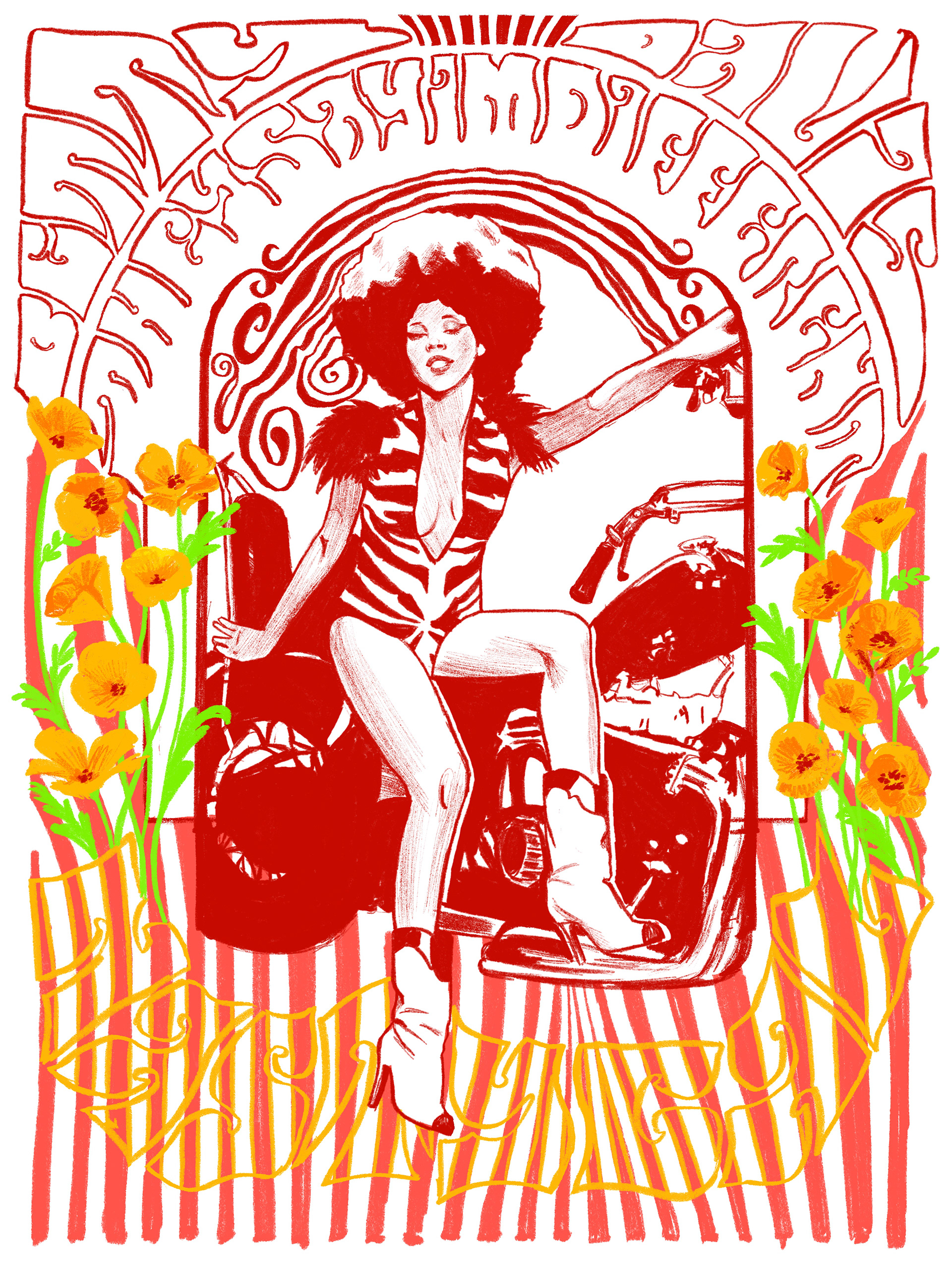
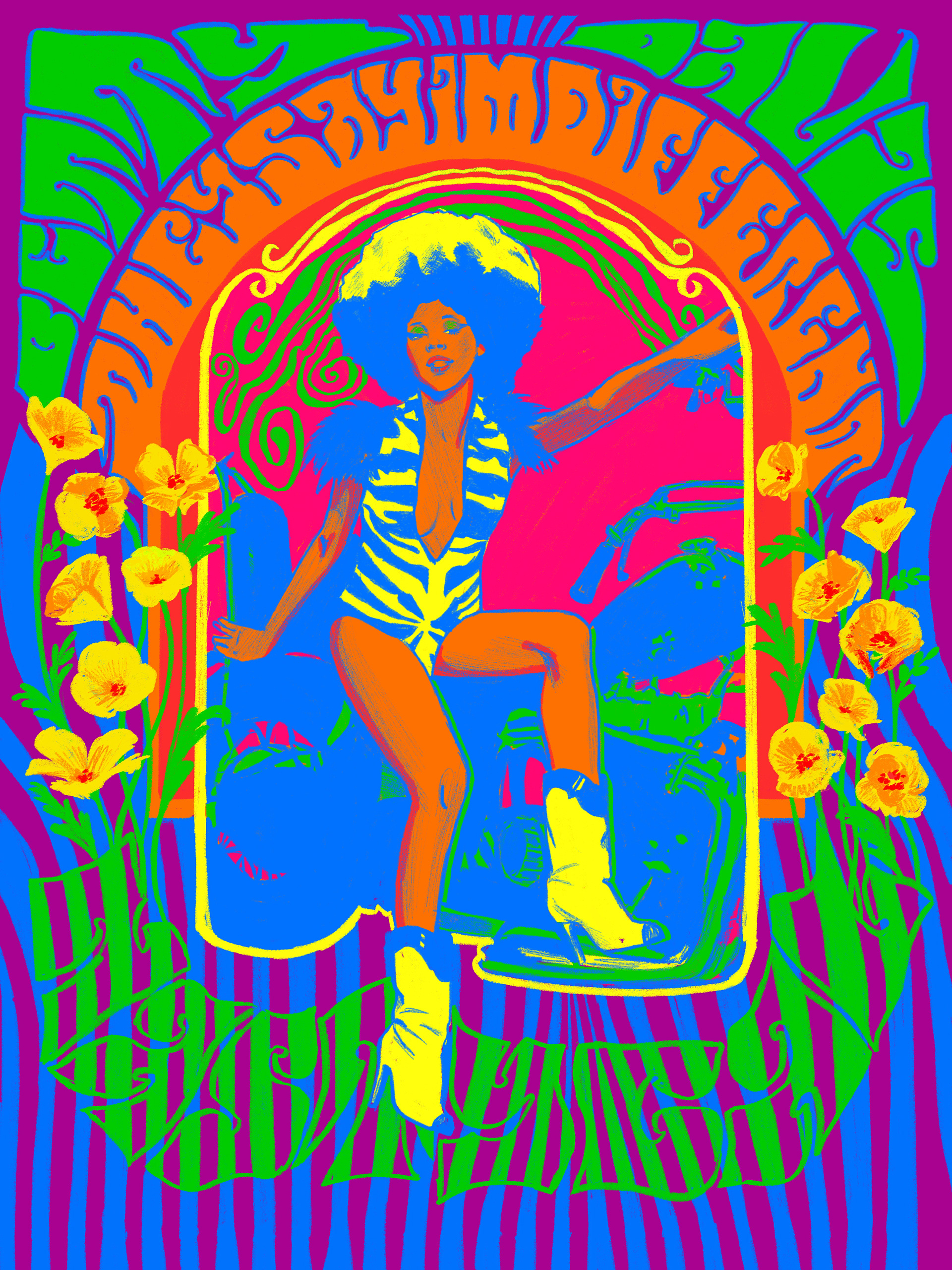
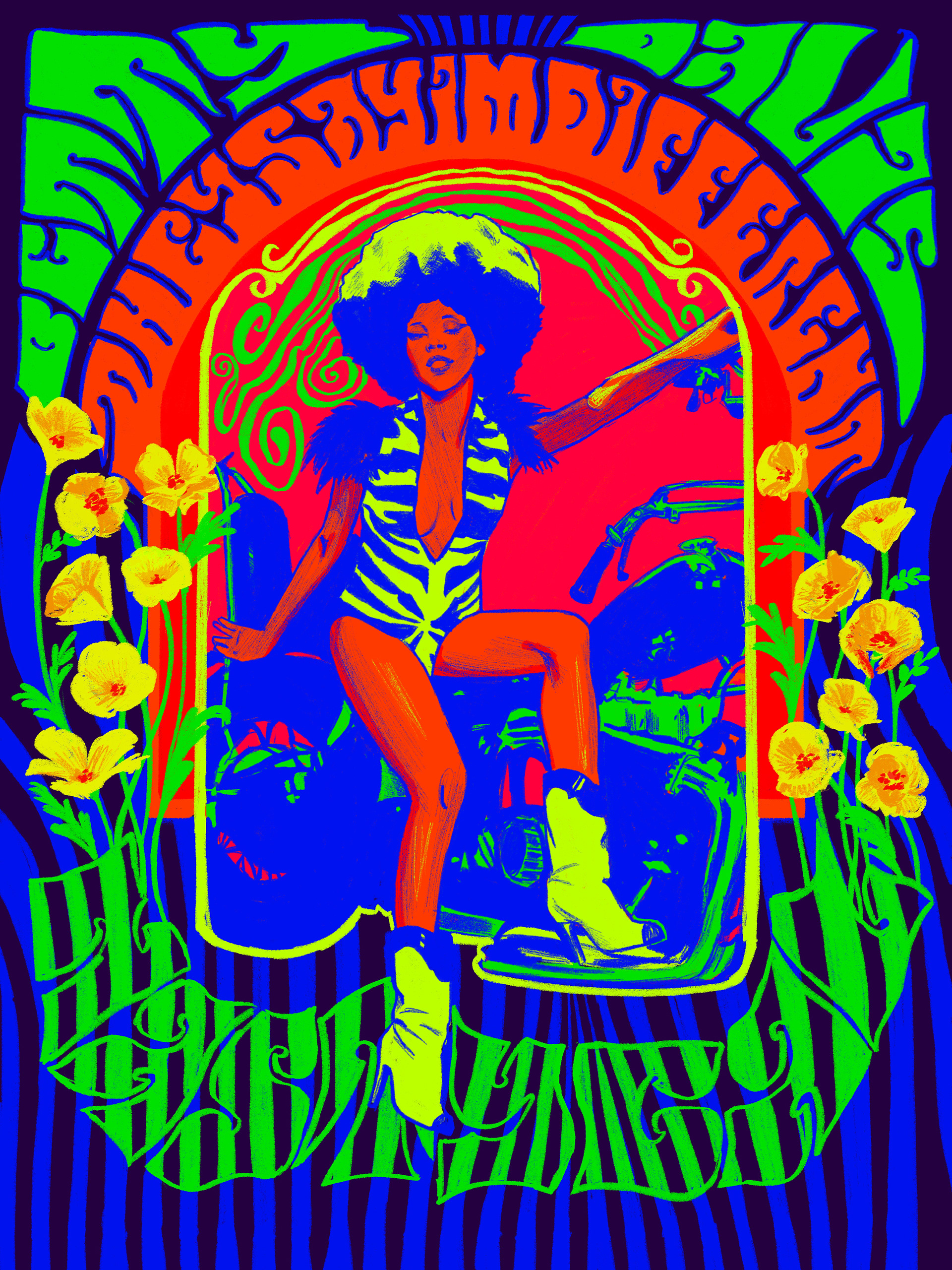
My painting, "The Funk Queen," featuring the trailblazing funk singer, Betty Davis, was created for and exhibited in the annual black light exhibition at Waterloo Arts gallery in Cleveland, OH. The theme of 2026 was PSYCHEDELIC, highlighting the live music and music posters of the 60s/70s and celebrating Waterloo Road's historic involvement in the scene.
Final Painting #1
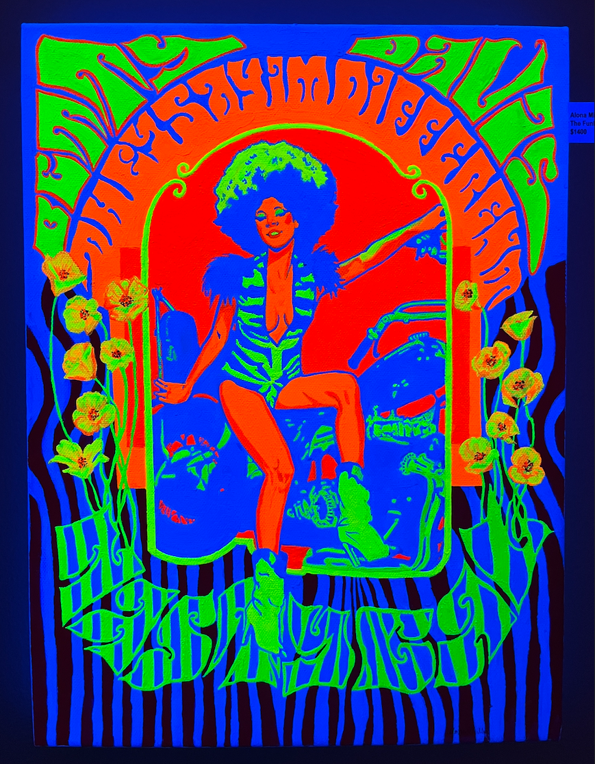
Final Painting #2
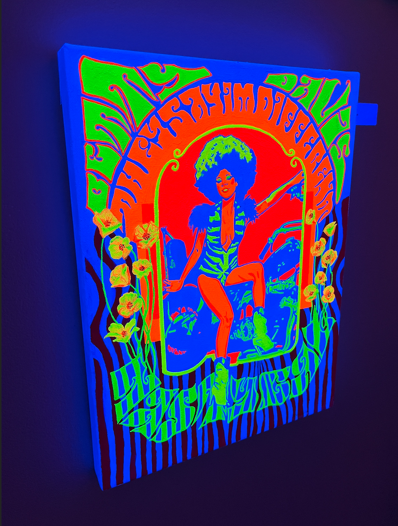
Final Painting #3 (no UV)
The Process
First rough sketch (left) vs. the final design (right).
I used these photos of Betty Davis by Fin Costello as references, because I believe these are the most iconic images of her, with Beyoncé even recreating this photoshoot for Halloween in 2024. I kept much of the lettering the same in the second draft, but ended up ultimately choosing the second reference photo and pose. Many of the posters of the Psychedelic 60s and 70s drew direct inspiration from the Art Nouveau period, defined by floral motifs and decorative artwork with lines that are sinuous, asymmetrical, and organic. In staying true to this theme, I felt this pose of Betty Davis was more fitting, with her full body and essence at the forefront.
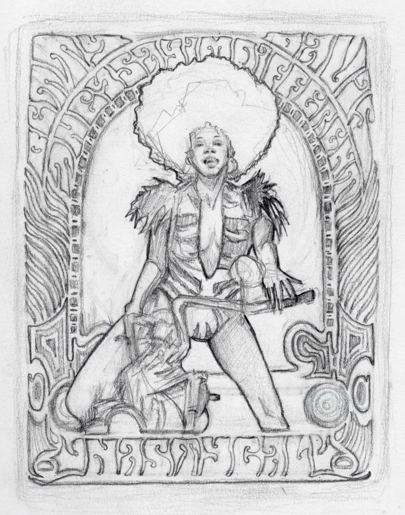
First Rough Pencil Sketch
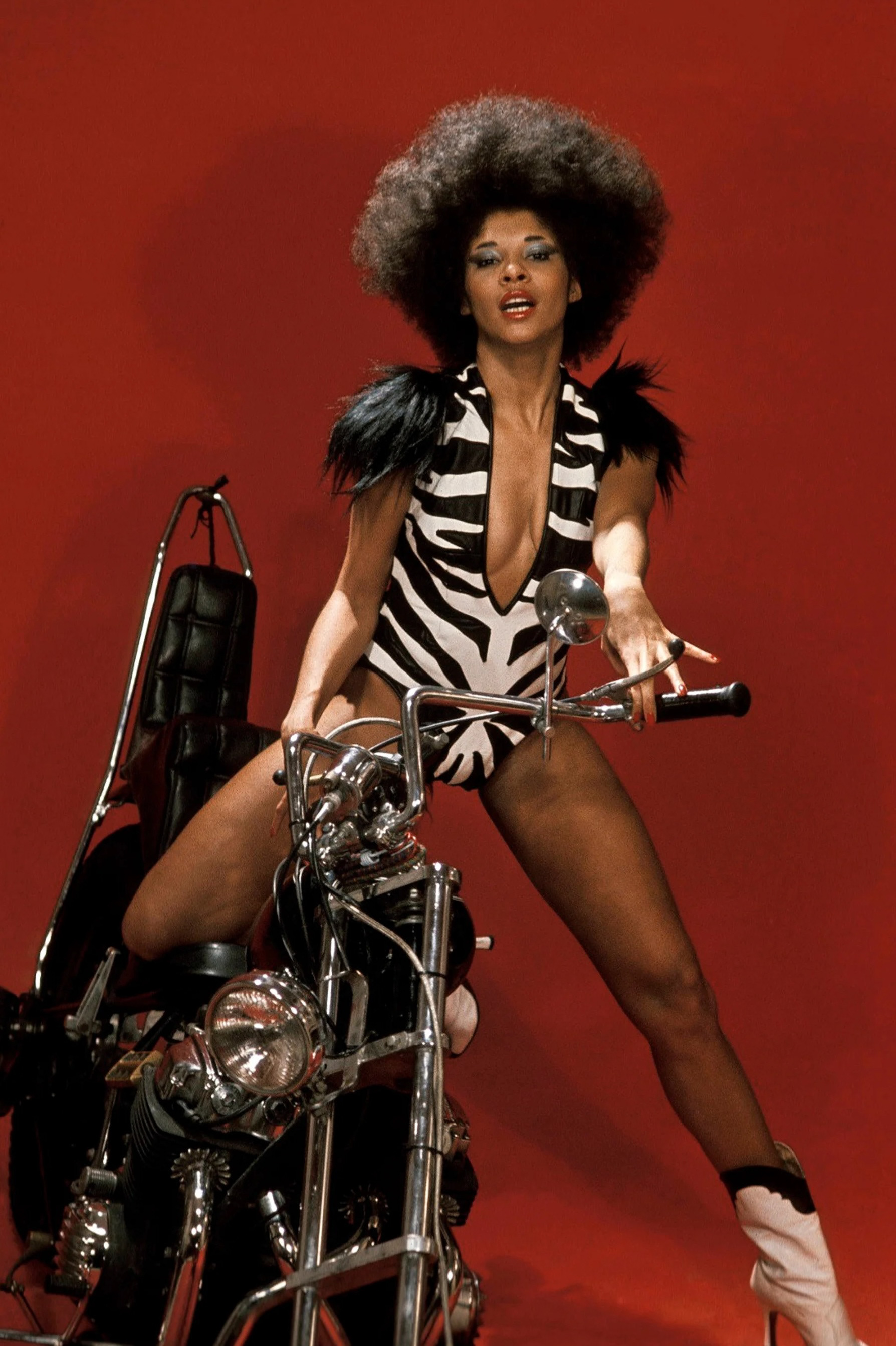
Reference Photo #1
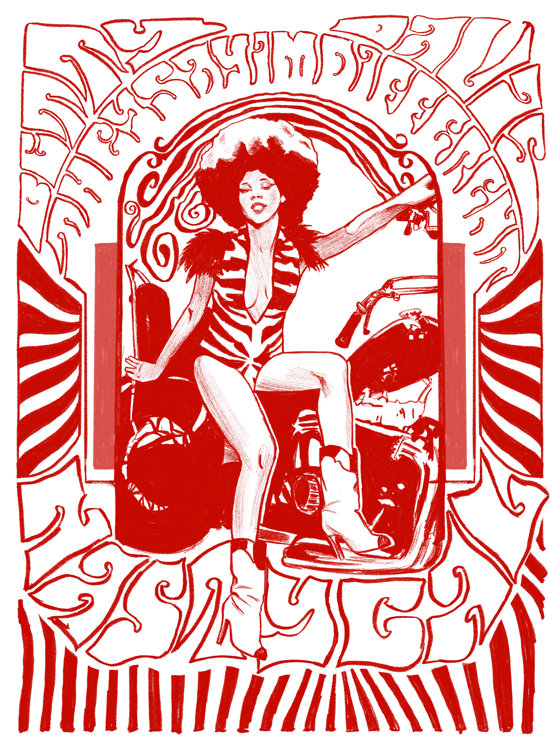
Second Digital Sketch
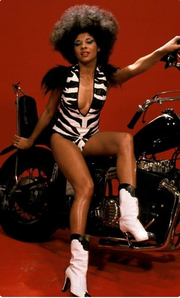
Reference Photo #2
I sketched my final idea digitally on my iPad, adding in poppies as florals to recall the usage of "psychedelics" that was popular during the era. I used digital swatches of what would be my palette for coloring. The challenge was that many of the colors did not appear the same on screen as they do to the naked eye in real life.
Third and Final Sketch
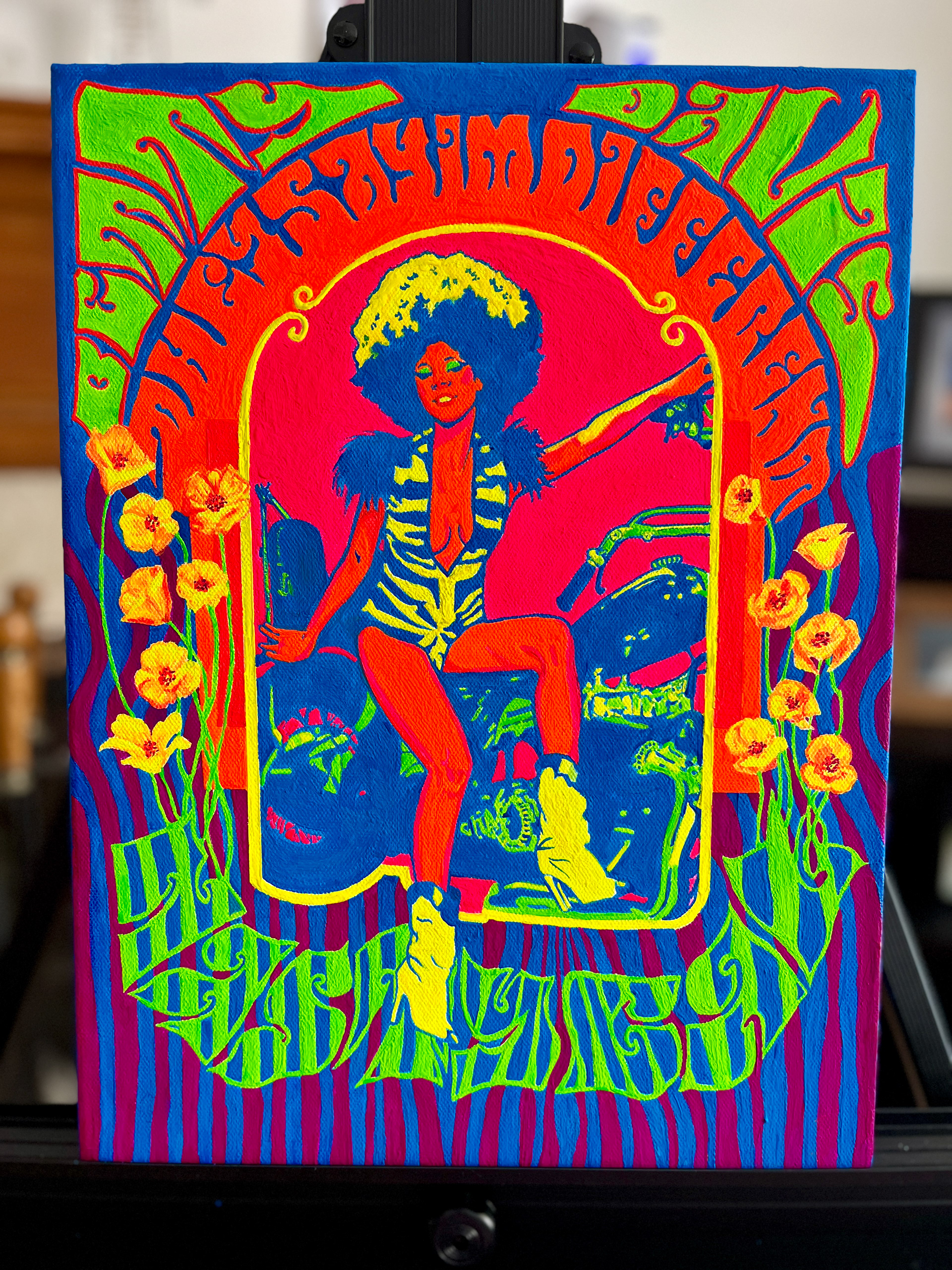
Final Digital Color (no UV)
Final Digital Color (with UV)
Because the paint was acrylic-based and used metal pigments to react under UV light for the glow effect, it was extremely thick and required a lot of layering. I alternated between painting with and without the UV light to make sure my brush strokes were cohesive, as the light sometimes made thinner layers appear more opaque. I did end up making a few practical changes to the design, like color placement and removing certain details, once I got a feel for the paint's behavior. Overall, I am satisfied with how the final piece turned out.
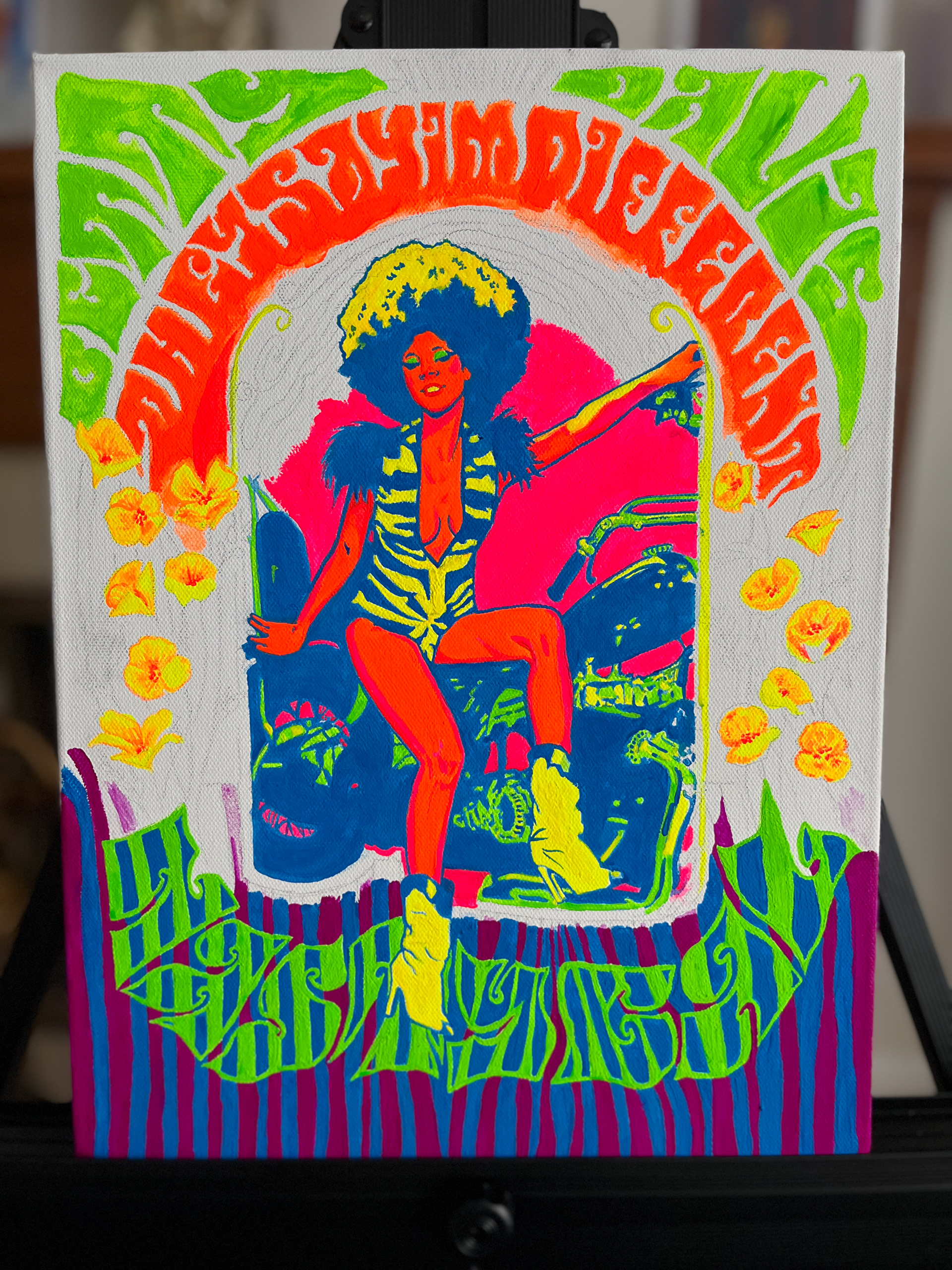
Painting Process #1